-
Notifications
You must be signed in to change notification settings - Fork 10.3k
New issue
Have a question about this project? Sign up for a free GitHub account to open an issue and contact its maintainers and the community.
By clicking “Sign up for GitHub”, you agree to our terms of service and privacy statement. We’ll occasionally send you account related emails.
Already on GitHub? Sign in to your account
[www] Refactor Homepage and Navigation & convert diagram to html/css #1605
Conversation
* refactor main navigation to component
* refactor mobile navigation to component
* slightly update mobile navigation UI:
  * use sidebar background color
  * use Gatsby logo color as icon and copy color
* add links to Discord, Twitter next to Github
* move "hero unit" and background to components
* drop linear-gradient and instead go with SVG background images and background-size:cover for the "hero unit" background…
* inline hero background SVGs
* add brand, sidebar, and hero background colors to presets
* procrastination bonus: silly CTA button hover effect
* remove Diagram "Deploy" icon for now
* tidy webpack.svg
* make use of presets.radius, brand colors
* tidy Diagram, Masthead and presets moar
* add gutters component, can't make rhythm work in utils/presets.js
|
Deploy preview ready! Built with commit 8e85004 |
|
Deploy preview failed. Built with commit 8e85004 https://app.netlify.com/sites/using-remark/deploys/59778d38cf321c76f2bbdc6d |
|
Deploy preview ready! Built with commit 8e85004 |
|
Deploy preview failed. Built with commit 8e85004 https://app.netlify.com/sites/gatsbyjs/deploys/59778d36cf321c76f2bbdc4f |
|
Deploy preview ready! Built with commit ff0d2af |
|
Deploy preview failed. Built with commit ff0d2af https://app.netlify.com/sites/gatsbygram/deploys/59797149a700c4471f91c105 |
|
Deploy preview ready! Built with commit ff0d2af |
|
Deploy preview failed. Built with commit 1ab61f7 https://app.netlify.com/sites/image-processing/deploys/5977906f0752d05a025f6961 |
|
Deploy preview failed. Built with commit 1ab61f7 https://app.netlify.com/sites/using-styled-components/deploys/5977906f0752d05a025f6967 |
|
Deploy preview failed. Built with commit 1ab61f7 https://app.netlify.com/sites/using-remark/deploys/5977906f0752d05a025f696c |
|
Deploy preview failed. Built with commit 1ab61f7 https://app.netlify.com/sites/using-contentful/deploys/5977906f0752d05a025f6969 |
…and increase its size for Desktop along the way.
|
Deploy preview failed. Built with commit d1f7f81 https://app.netlify.com/sites/using-postcss-sass/deploys/5977af11424ef2274f48eac7 |
|
All these Netlify failures seem like internal to them problems. This build for GatsbyJS succeeded however https://5977af10424ef2274f48eabb--gatsbyjs.netlify.com/ Looking really cool. |
|
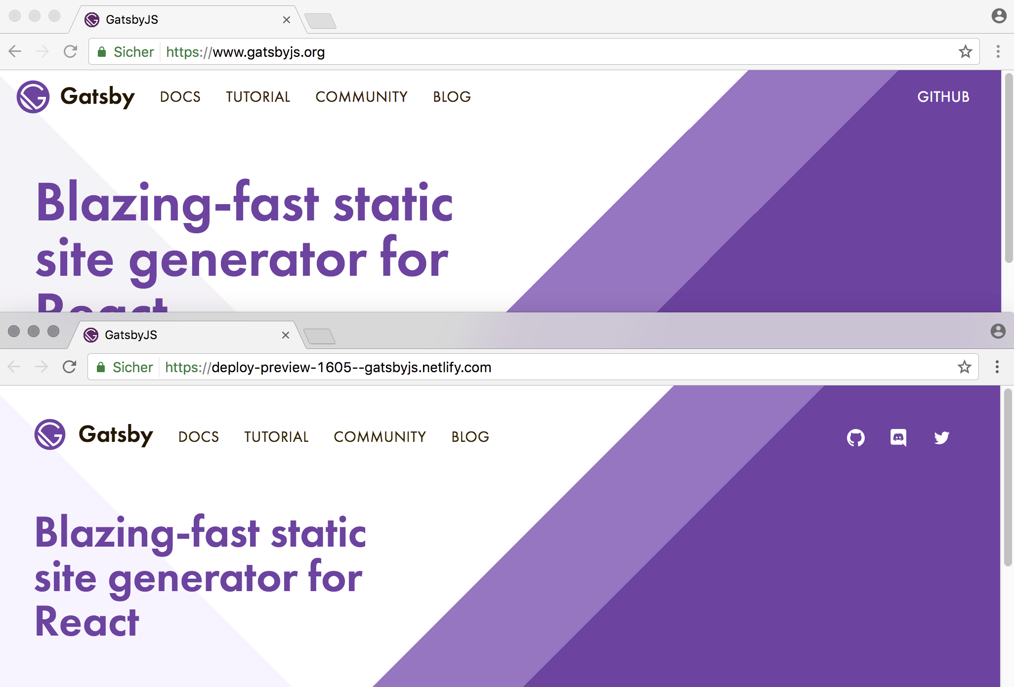
I fixed a few more things, but won't be able to do much more tonight than at least to explain what's all the noise in here: I originally started off with the intention to fix the whitespace around the homepage navigation – along came an icon replacing the "Github" link and links to the Discord Reactiflux Gatsby channel and the GatsbyJS Twitter: Then I somehow ended up redoing the homepage masthead background as inline SVGs (was linear-gradient before) … this is not super precise either, but for me it lowers the "magic gradient stop number" issues of the previous approach a little. Then I went to procrastination wonderland:
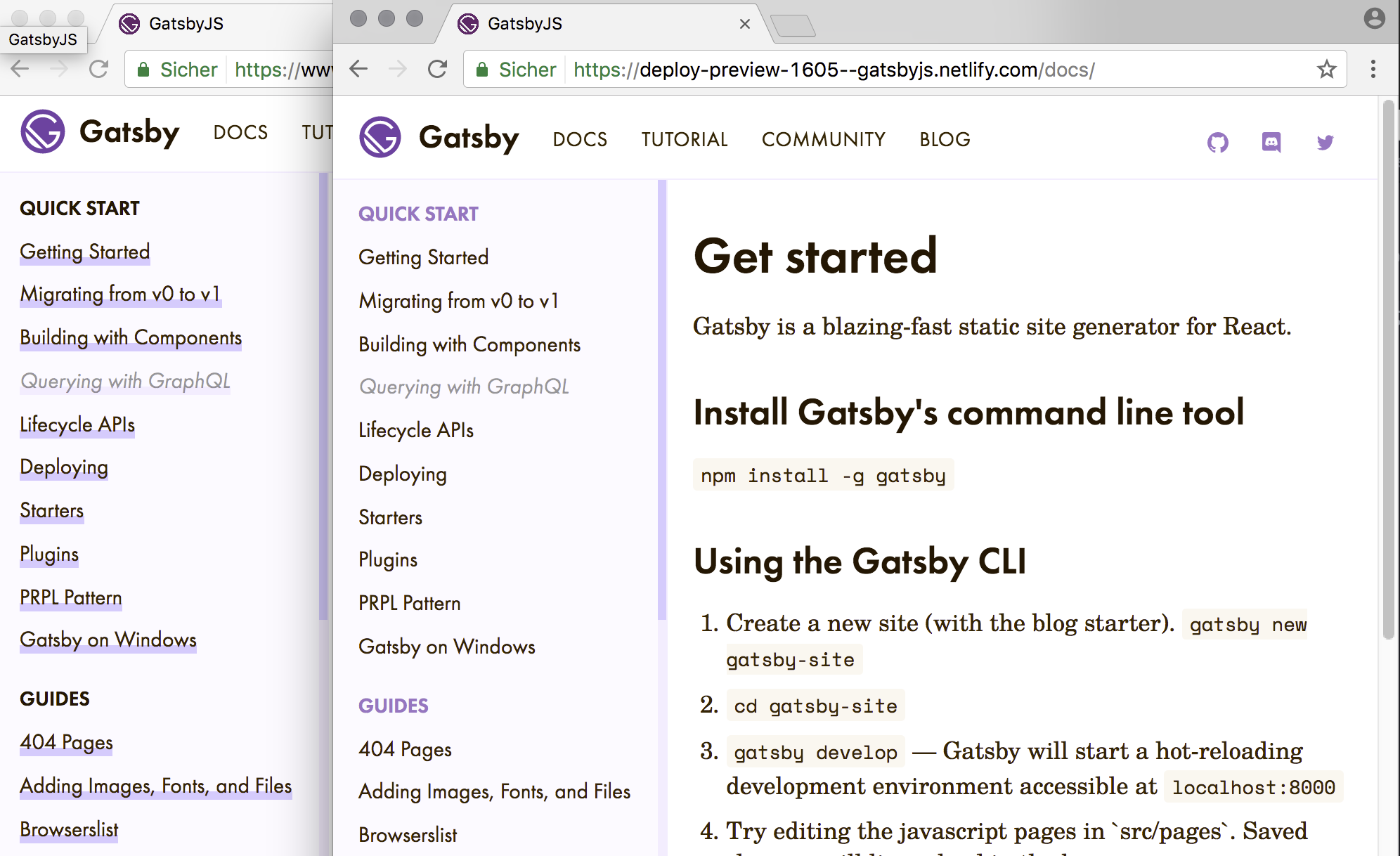
One thing that also happened along the way is that I removed the bold underlines from the sidebar links – that didn't happen very conciously though, so now that I look at all that purple … That said, I'm also not too sure about those rounded edges any more. :-D |
|
This is sooo cool! It's beginning to look really really polished. A few notes.
|
|
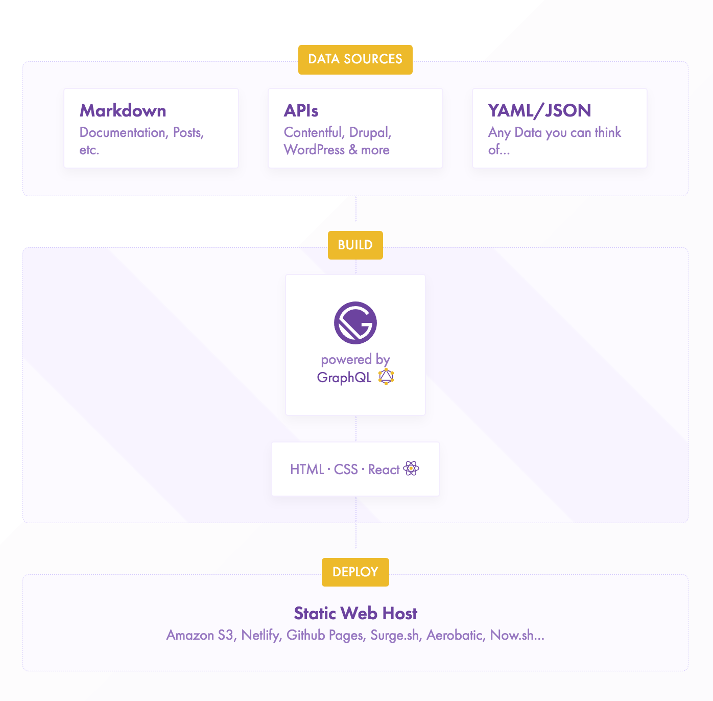
Looking at latest build (https://597908907960b1275563eed4--gatsbyjs.netlify.com/) at the diagram and was thinking it'd be nice to change "YAML/JSON" to "YAML, JSON, CSV". CSV is a hugely important way of storing data and I think this will be an attractive feature for a lot of people. |
|
Actually, thinking some more. Make the center box "CMSs" and the last header "Data" and the text inside the box "APIs, Databases, YAML, JSON, CSV, and more!" Also make the order CMSs, Markdown, Data. |


WiP still unfortunately, but getting close! Little time right now, but will follow up with a decent list of what's changed and why later on … let's get this preview built now :P
Blockers: