-
Notifications
You must be signed in to change notification settings - Fork 10.3k
New issue
Have a question about this project? Sign up for a free GitHub account to open an issue and contact its maintainers and the community.
By clicking “Sign up for GitHub”, you agree to our terms of service and privacy statement. We’ll occasionally send you account related emails.
Already on GitHub? Sign in to your account
[1.0] Discuss next steps on gatsbyjs.org design #1173
Comments
|
I don't have a ton of time myself either so it'd be great to collaborate with somebody else who could take care of implementing the new design + the diagram. For now I think the priority is settling on the content though, once that's done I can finalize my mockup and we can start thinking about the implementation (same with the diagram). |
|
I really like the new design and color scheme! ❤️ the diagonal design by @SachaG. Clean and fresh. I can see the potential with transitions. I don't have much spare time myself nowadays either, so for now it's just some minor feedback. I am interested in figuring out page transitions somewhere in the coming weeks, so possibly I can help in that direction. IMO the new design and copy is really fine for now. Proposed onboarding makes perfect sense. I have my doubts about the diagram, but will write that in the discussion there. |
|
I don't have the time to do the website style, but this is my little contribution (because it's was fun to make ^^): // @SachaG background for home
const homeBackground = {
backgroundImage: `
linear-gradient(-45deg, #744c9e 35%, transparent 35%),
linear-gradient(-45deg, #9d7cbf 50%, transparent 50%),
linear-gradient(45deg, #f5f3f7 50%, white 50%)`,
}; |
|
We also should add testimonials. There's been lots of tweets we could use + there's been some good stuff said about Gatsby on HN, in person, etc. that we could gather. |
|
@KyleAMathews fantastic work! so pleased you went in this direction 🎉 Sacha's mockup looks superb - especially the 'used by' logos above the fold. I'm completely swamped atm but I'm going to have free time to put toward this in July regarding implementing the design - don't know if that's too late. Wonderful stuff. |
|
Looks nice! I like the bolder colors as well, and I love the cut-off logos in the info boxes! |
|
stripe style , nice |
|
@ArchieHicklin nice! I really like the bolder colors and the info boxes
Gatsby v1 will launch before then so we'll want to have the frontpage fairly polished before then. But that being said, I'm sure sure there'd be plenty of things you could do to help improve the website still. Also in the meantime, would love any quick reviews you could give of designs / implementations we make. |
|
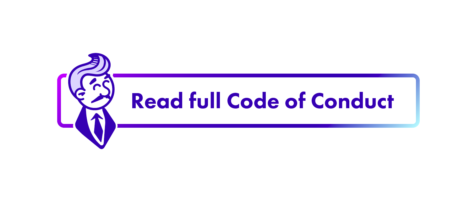
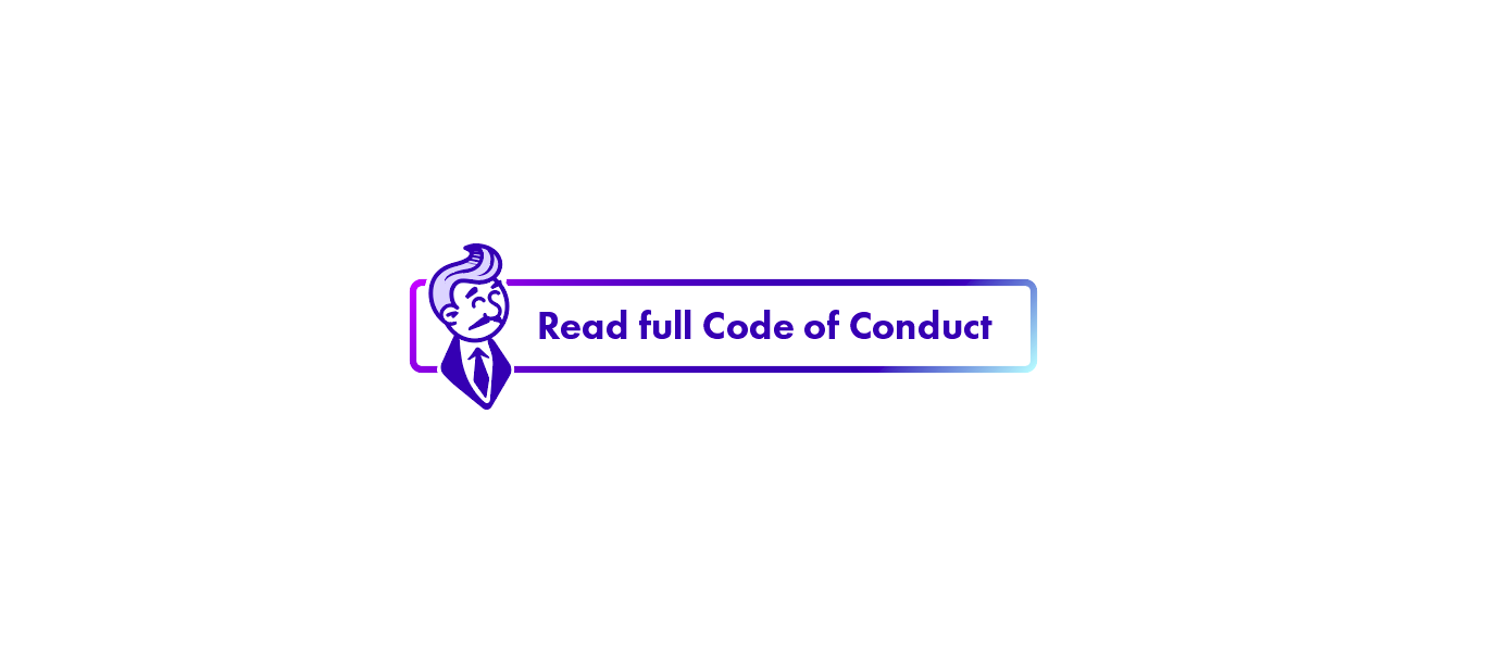
Hi everyone! Over the weekend I set out to recolor the "cute Gatsby guy" @ArchieHicklin did last year, trying to bring it in line with the current design direction/color palette. I think including him "as part of little helpful callouts" like @KyleAMathews suggested would add a nice touch in support of the already friendly, welcoming tone of the documentation and tutorial. I struggled a bit with my initial intention and ended up drawing my own version (inspired quite a bit by the Pringles character and "Rich Uncle Pennybags" aka the Monopoly man I guess ;-)): Apart from some quick fixes to the hair, this pretty much is the first draft – I don't like the body part much (although it kinda works for the use case shown, which is not a callout, but a button :-/) and would like to try a simple fly instead of the tie … What do you guys think? |
|
@fk Beautiful! |
|
@ArchieHicklin Thank you Archie! 😘 |
|
I like the reduced jacket and tie in the PRO TIP example over the bow-tie, though the collar of the shirt is a bit overpowering. |
|
This came off as a bit odd to me:
You're talking about it being easy to deploy to Netlify etc, but there are plenty of non-fast sites on global cloud infrastructure. It's also untrue if someone just drops the static build on shared hosting or a VPS slice or something. Maybe something like:
|
|
I'm going to work to incorporate #1172 + @SachaG's header mockup into the frontpage today. Working on tying up a few last loose ends before pushing out the 1.0.0 release tomorrow :-D 1.0.0 doesn't mean the frontpage is done by any means though so not closing this issue. @ArchieHicklin I really like your colors but I'm not competent enough at colors to incorporate those into the site. Would love you to take a run at the site later this month when you have some time! |
|
The website design is humming along. Thanks for everyone who's been helping! |
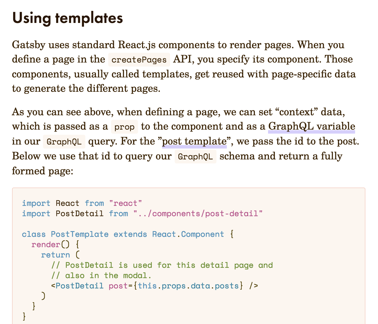
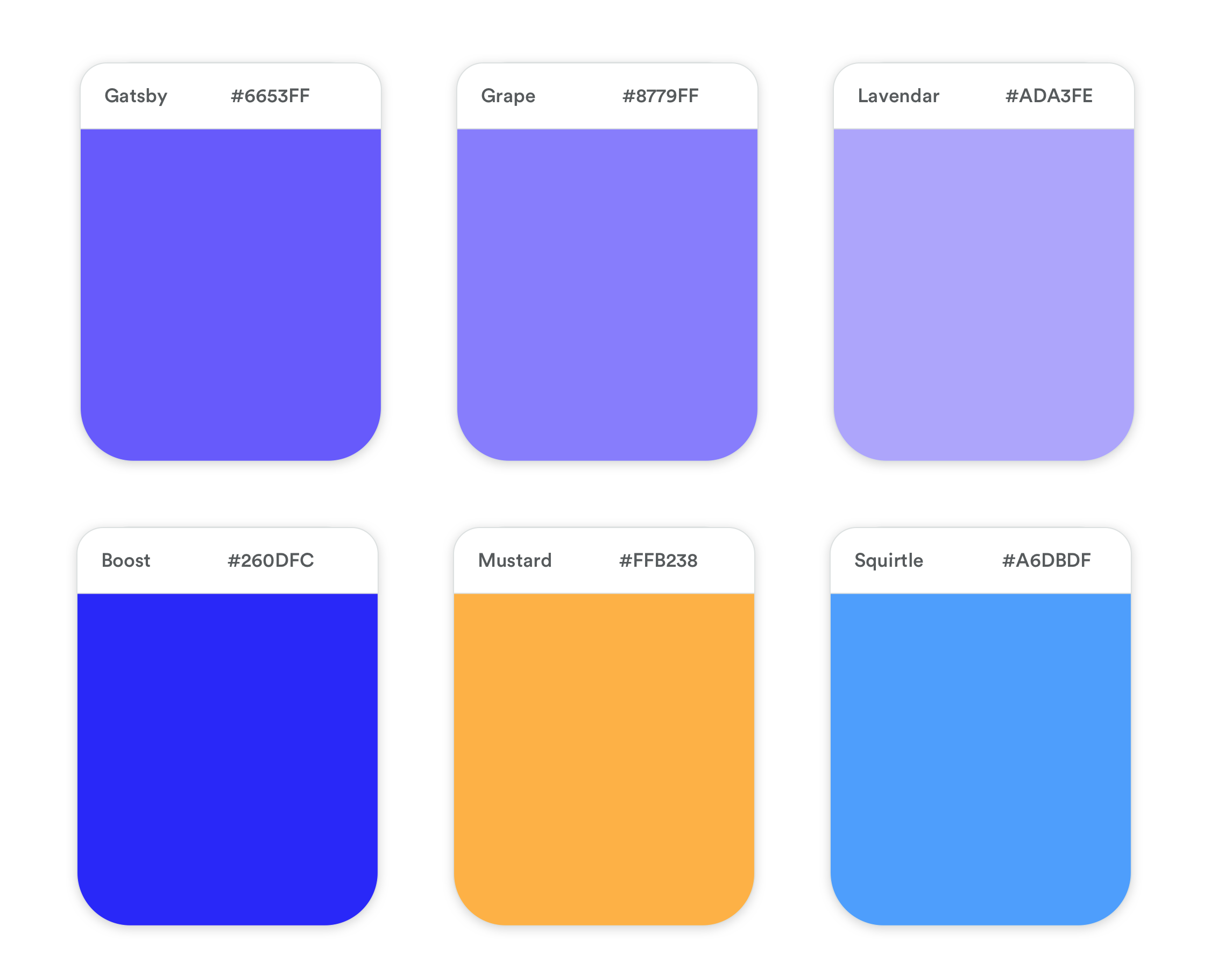
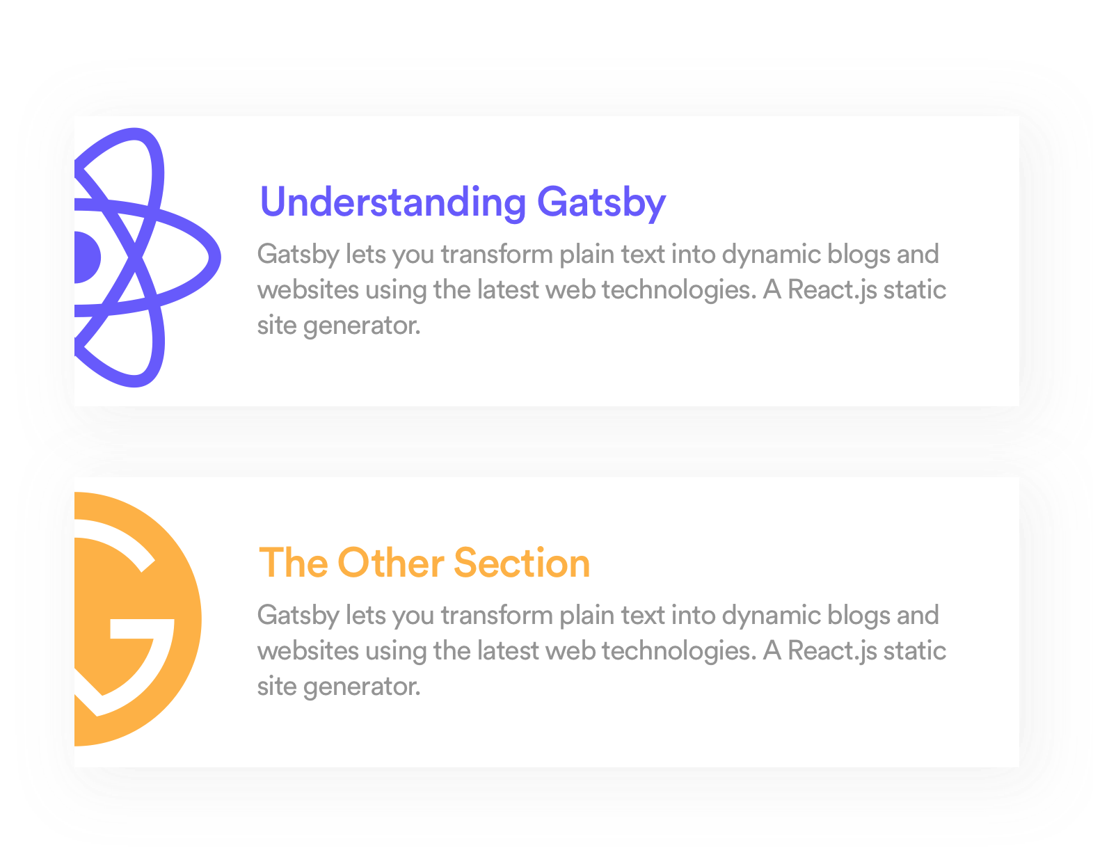



Today I did a redesign of gatsbyjs.org. Highlights, we're purple now! Thanks to @ArchieHicklin for pushing me this direction.
Things are still pretty rough though.
This is the front page as of now:
Things to discuss / do:
The text was updated successfully, but these errors were encountered: