We want to show you a tool so vital that it may amaze you as a designer. It’s as underrated as silence between musical notes. However, it’s powerful enough to mean keeping people on your page – survival, in other words.
Many elements form the layout and structure of an interactive design. Often neglected, one of the most vital is white space (or negative space), the space found inside and surrounding the other design elements.
For a website or app, many different visual elements make up the layout. These include typography, drawn lines, icons, images, etc. Imagine a painting; these parts are the painted bits. However, what do they all need to form that painting? They need a canvas! White space is like a canvas: it’s the background that holds the elements together in a design, enabling them to stand out.
Let’s see why designing the white space is so important.
What is White Space?
White space is the area between design elements. It is also the space within individual design elements, including the space between typography glyphs (readable characters).
Despite its name, white space does not need to be white. It can be any color, texture, pattern, or even a background image.
White space can cause problems between designers and clients. Design theory promotes the use of white space for elegance and ensuring a quality user experience. Sadly, many clients and managers consider white space wasted space. They think it could be used to house more information or other visual elements.
On the contrary, white space is a great tool to balance design elements and better organize content to improve the visual communication experience. If you were a technical writer in charge of composing hundreds of manuals for a kitchen appliance company, you would work to find a superb balance of words and images. Few people read manuals for pleasure; it is then crucial to hold the readers’ attention! For that, the white space is the real star of the show, working between the words and the pictures. It keeps each page from looking busy. Instead of calling the helpline, readers will digest the troubleshooting advice.
People get frustrated when information bombards them. We’re humans, not machines. White space calms us, letting us “breathe”.
As with the other user interface elements, you as a designer need to understand the role white space plays and experiment to find the right balance between it and the rest of the elements.
Micro vs. Macro White Space
White space is commonly categorized based on the density of micro white space and its relationship to macro white space. We’re talking about ratios and proportions.
Micro White Space
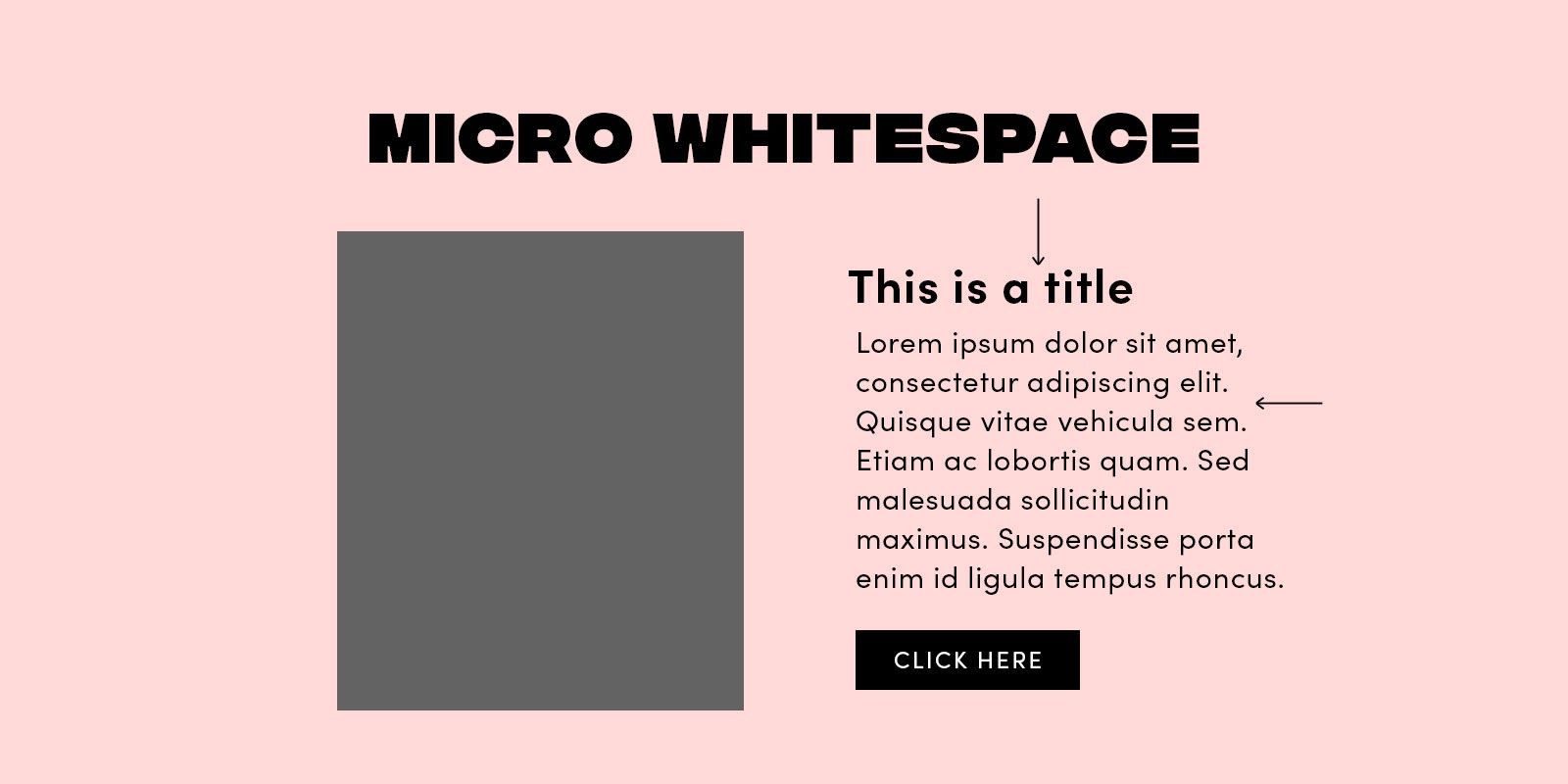
We call the small space between design elements micro white space. You can find it between lines and paragraphs. It includes the space between grid images and that used to separate menu links.
Micro white space has a direct impact on content legibility. For example, marginal white space surrounding paragraphs affects the user’s reading speed and comprehension. If text appears in margins outside regular paragraphs, people read it more slowly. They find it harder to understand than text without such margins.
Macro White Space
Macro white space is the large space between major layout elements, and the space surrounding the design layout. You’ll find macro white space to the right and the left of most websites’ content, and in the space between a website’s content blocks.
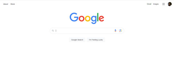
Unlike micro white space, macro white space acts as a container of the overall design. It’s “big picture” white space – easier to notice. Probably the best example of a website that implements macro white space intensively (and effectively) is the homepage of Google.com. Google’s iconic look is beautifully simple, but did you notice something else? That simplicity is also calming. Because there’s no clutter, there’s less work for your eyes and mind. You can focus on the reason you’re there: to search for something!
There’s a great story behind why Google ended up this way. Google.com was one of the first websites to make extensive use of white space. When they started out, Internet connections were far slower. Participants in user tests would wait for the page to download despite everything already being on screen. They were not used to seeing so much white space! From these user tests, designers at Google decided to add the copyright notice at the bottom of the page for users to know that the page was fully loaded.
So, What Determines Which White Space You Should Use?
The use of both macro and micro spaces depends on the following factors:
Content - With more information in the layout, fewer amounts of macro white space will be available. In contrast, the volume of micro white space will increase. This compromise is vital; otherwise, pages would be solid chunks of data: extremely difficult to read! For example, Boulton (2007) describes how news websites tend to depend on micro white space to provide an effective legible experience for users. Users’ reading comfort is crucial.
Design - The user interface design influences the ratio between micro and macro white spaces in the layout. The designer chooses the design style. This can bias the layout to one type of white space over another.
User – User research (including demographic information) can be used to determine the right balance of macro and micro white spaces for that specific audience. There is no “rule of thumb” to apply consistently between audiences. As always in user experience, we need to check with the target users of our product or service.
Branding message – Using white space can suggest a company’s budget and thus the quality of the product. Think of the branding for companies such as Apple, Mercedes Benz, and IKEA. How do they support this theory?
The image below shows both macro and micro white spaces on an old page of the BBC news website. Mirroring paper newspapers, news websites tend to make scarce use of white space. Instead, they show their credibility through this high quantity of content on the page. They reflect how “happening” our world is!

Active vs. Passive: Another Way to Approach the Usefulness of White Space
Besides the differentiation between micro and macro white space, you can also look at white space as being active or passive.
Active white space - the white space used to enhance page structure and help guide the user through the page’s content.
Passive white space – applied to improve the aesthetics of the layout without guiding the user through a specific reading, flow, or content order. For example, the white space between font glyphs and paragraph lines functions in this way (Boulton, 2007).

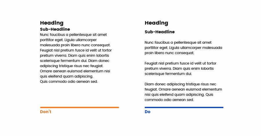
The image above shows the difference between text with no white space applied, passive white space applied, as well as both passive and active white spaces applied:
On the left side of the image, the text doesn’t have any real amount of white space between characters, rows, paragraphs, etc. We notice straightaway that the lack of white space makes the text crushed and compressed. It’s very tough to read.
In the central example, we’ve added some passive (and micro) white space. Do you notice how much easier you can read it than the first?
Moving to the right-hand-side example, we’ve added some active white space to guide ourselves through the text. Happily, that hard “wall of text” we first saw has become something laid out in a format we’re used to. White space may enhance the overall readability and flow of the text, but we also need it for the sake of our eyes and sanity!
Three Elements to Consider When Designing Negative Space
Legibility
As we saw, micro white space is essential for making interface content legible. As a designer, you should consider white space when choosing the design typography specifications, such as font, size, color, style, leading, kerning, and tracking. Remember the image from the previous page? Changing the white space layout affects reading performance and overall user experience. Happy readers are far more likely to stay on your page.
Design Tone and Branding
White space contributes to the tone of the overall design. Websites with larger amounts of macro white space may reflect minimalism and luxury. Websites with smaller amounts of macro white space may come across as informative, as is the case with news websites (Kyrnin, 2015).
Note: these indications aren’t “set in stone”. It’s always best to test the use of white space on your users. Only they can tell you how they perceive your designs.
Focus and Attention
White space can help guide the user through interactive content. It may help to build focal points and direct the user’s attention to specific layout parts.
Part of the strategic planning for a website is giving priority to specific elements or content. You can use many visual methods to spotlight specific elements; one is to play with the amounts of white space around these focal points. The branding and print industries apply this theory to draw attention to brand messages.
The Take-away
White space (negative space) is the area between design elements. It's another tool for designers to design for the user experience (UX). Remember that white space is not necessarily white; it’s just the name to indicate spaces where there are neither user interface (UI) elements nor specific content.
As a designer, you can introduce white space based on four main factors:
Content,
Design,
user and
brand
Use macro white space to organize content in the layout and direct the user through the blocks of content shown. Use micro white space inside the design element features as seen in the text, images and content blocks.
We can also approach white space as being passive or active. Passive white space does not have a specific role in the design other than facilitating the user experience. It is all about being easier to read. Active white space guides the focus and attention of users. It is more about standing out and making a statement.
References & Where to Learn More
Many articles exist online about white space and its relevance in design. The following is a list of articles where you can delve into the power and usage of negative space.
Boag, P. (2011, February 15) Why White Space Matters. Boag World. [2014, June 20]
Boulton, M. (2007).Whitespace. A List Apart. [2015, April]
Kollin, Z. UX Myths.Myth #28:White Space Is Wasted Space. [2014, June 20]
Kyrnin, J. The Importance of White Space in Web Designs. Web Design Basics. [2014, June 20]
Turnbull, C. Using White Space (or Negative Space) in Your Designs. Web Design Tuts Plus. [2014, June 20]
Hero Image: Author/Copyright holder: Julia Kay. Copyright terms and licence: CC BY 2.0