-
Notifications
You must be signed in to change notification settings - Fork 10.3k
New issue
Have a question about this project? Sign up for a free GitHub account to open an issue and contact its maintainers and the community.
By clicking “Sign up for GitHub”, you agree to our terms of service and privacy statement. We’ll occasionally send you account related emails.
Already on GitHub? Sign in to your account
feat(docs): Table of Contents component #15251
Conversation
There was a problem hiding this comment.
Choose a reason for hiding this comment
The reason will be displayed to describe this comment to others. Learn more.
Woah! This is awesome 🎉 Thanks so much for working on this!
I left a couple suggestions...
And based off of Marcy's acceptance criteria in the issue (#6896) there's probably a couple more things to add but I'm excited for this.
Co-Authored-By: gillkyle <kylerobertgill@gmail.com>
There was a problem hiding this comment.
Choose a reason for hiding this comment
The reason will be displayed to describe this comment to others. Learn more.
This is awesome, and so simple! I agree that we'll want a way to disable it on some pages. Any ideas for a frontmatter key (tableOfContents: false)?
|
Hello! Fun to see this! I don't know if someone has mentioned this yet. I
also think the design could use colors that are a little softer (e.g. the
text could be medium grey and the bullet points perhaps medium grey too).
Because we want people to be able to reference the ToC, yet not have it
compete visually with the main document. Perhaps removing the drop shadow
would also make the area less emphasized. Exciting to see this progressing!
…On Tue, Jul 9, 2019 at 4:04 PM Marcy Sutton ***@***.***> wrote:
***@***.**** requested changes on this pull request.
This is awesome, and so simple! I agree that we'll want a way to disable
it on some pages. Any ideas for a frontmatter key (tableOfContents: false
)?
------------------------------
In www/src/components/docs-table-of-contents.js
<#15251 (comment)>:
> + marginLeft: space[10],
+ position: `sticky`,
+ top: 130,
+ },
+ }}
+ >
+ <h2
+ css={{
+ textTransform: `uppercase`,
+ fontSize: fontSizes[2],
+ color: colors.grey[60],
+ }}
+ >
+ Table of Contents
+ </h2>
+ <nav>
Can the h2 go in the nav here to act as a label for it?
—
You are receiving this because you were mentioned.
Reply to this email directly, view it on GitHub
<#15251?email_source=notifications&email_token=AHXWRWQYSPHODSLLNX35ISTP6UKQBA5CNFSM4H4L44PKYY3PNVWWK3TUL52HS4DFWFIHK3DMKJSXC5LFON2FEZLWNFSXPKTDN5WW2ZLOORPWSZGOB56D6LA#pullrequestreview-259800876>,
or mute the thread
<https://github.com/notifications/unsubscribe-auth/AHXWRWWZ36IYQ5VWWTY2P23P6UKQBANCNFSM4H4L44PA>
.
|
As long as the colors meet contrast requirements for regular text, sounds like a good design decision to me! |
|
☝️👍 Contrast scores also are available in the modal for each color group on https://www.gatsbyjs.org/guidelines/color/ btw. |
| <h2 | ||
| css={{ | ||
| textTransform: `uppercase`, | ||
| fontSize: fontSizes[2], |
There was a problem hiding this comment.
Choose a reason for hiding this comment
The reason will be displayed to describe this comment to others. Learn more.
I'd go for fontSizes[1] here, and throw in a letterSpacing: letterSpacings.tracked—ref. the excellent https://practicaltypography.com/letterspacing.html for why we want extra letterspacing for all caps text.
There was a problem hiding this comment.
Choose a reason for hiding this comment
The reason will be displayed to describe this comment to others. Learn more.
Done
| @@ -49,11 +51,26 @@ function DocsTemplate({ data, location }) { | |||
| enableScrollSync={urlSegment === `docs` ? false : true} | |||
| > | |||
| <DocSearchContent> | |||
| <Container> | |||
| <Container | |||
There was a problem hiding this comment.
Choose a reason for hiding this comment
The reason will be displayed to describe this comment to others. Learn more.
I just gave this a spin last night locally (insomnia), and noticed that the main content currently sticks to the left of the…"main sidebar nav" (the one to the left, containing the navigation for "Docs/Tutorial/Features")…on large screens where the TOC is positioned to the right of the main content:
IMO we want the whole content, including our new TOC sidebar, to stay centered. Not super trivial, but also not too hard to do—so I got tempted, and gave that a quick shot. Pushed my stuff here:
8616bc1
There was a problem hiding this comment.
Choose a reason for hiding this comment
The reason will be displayed to describe this comment to others. Learn more.
Here's how what is in that PoC branch looks like:
It's not perfect (started off with a different approach, so it's not fully fluid yet, container size is "hardcoded" a little more than it needs still, so if the ToC content doesn't need the full width of what the layout container currently reserves for it, things look a little weird (uncentered)), but maybe it helps a little!
There was a problem hiding this comment.
Choose a reason for hiding this comment
The reason will be displayed to describe this comment to others. Learn more.
- To make it a bit easier to get there (and understand/maintain this stuff in the future), this drops pulling
.gatsby-highlight& Co. to the left/right formediaQueries.lg—no need to worry about this detail IMO. It was fun while it lasted, time to move on. (happened intypography.js) - Also I thought it's time to drop defining
<Container>smaxWidthasrhythm, and added those values totokens/sizesasrems. - That commit might also include what I mentioned in https://github.com/gatsbyjs/gatsby/pull/15251/files#r302286146
¯\_(ツ)_/¯😉
Infamous last words: We eventually have to take care of the TOC sidebar height, too.
There was a problem hiding this comment.
Choose a reason for hiding this comment
The reason will be displayed to describe this comment to others. Learn more.
Yeah thank you @fk for this. The container being pushed around felt very hacky when I built it but this is looking to be much better! I will look into this deeper later
There was a problem hiding this comment.
Choose a reason for hiding this comment
The reason will be displayed to describe this comment to others. Learn more.
Thank you, Ben—your work made it really easy for me to jump in to do this! 🙌
Sorry for the sloppy commit there—it looks a bit much, but IMO contains a lot of valuable changes. Please don't hesitate to reach out if something is unclear, or just pick what you think is valuable. One thing I want to trying clarifying is what I meant by
started off with a different approach, so it's not fully fluid yet, container size is "hardcoded" a little more than it needs still, so if the ToC content doesn't need the full width of what the layout container currently reserves for it, things look a little weird (uncentered)
—I think we might not need to define a maxWidth for the outer container at all:
There was a problem hiding this comment.
Choose a reason for hiding this comment
The reason will be displayed to describe this comment to others. Learn more.
^ Ah no, ignore that last bit about maxWidth—I think that PoC is as good as it gets with the <h1> and the requirements defined in #6896 (comment) (ToC following the main headline on smaller screens), at least if we don't want to throw in some JS yada yada, or go for left-aligned content once the ToC on the right kicks in (which isn't too bad, thinking about that again), or revisit the requirements.
Better to worry about content becoming inaccessible if the ToC height exceeds the viewport height IMO. Wondering if we want to avoid two scrollbars relatively close to each other here? An approach as https://react-sticky-box.codecks.io/ looks interesting irt to that.
There was a problem hiding this comment.
Choose a reason for hiding this comment
The reason will be displayed to describe this comment to others. Learn more.
Pushed a quick rudimentary fix for the latter to https://github.com/gatsbyjs/gatsby/tree/topics/15251-layout (5951933).
There was a problem hiding this comment.
Choose a reason for hiding this comment
The reason will be displayed to describe this comment to others. Learn more.
Done. This has been merged into my branch.
|
Just a notice I will likely continue work on this PR on Thursday. Been busy with other things this week but the end of the week is much lighter |
There was a problem hiding this comment.
Choose a reason for hiding this comment
The reason will be displayed to describe this comment to others. Learn more.
I made comments a couple weeks ago with my full review! Just making sure to do this so github doesn't keep reminding me to leave a review :)
Co-authored-by: Florian Kissling <21834+fk@users.noreply.github.com>
Also removing console.log
|
Alright, so I continued some work with this. I merged in the changes @fk made in a side branch so the container stuff is a bit more succinct and the design fits better. With what @marcysutton commented for the disabling of the table of contents, I added a There seems to be some issues with the www unit tests. I will try debugging those later this weekend. |
|
I just saw that same error locally that's coming up on Circle |
|
@lannonbr @marcysutton Tests are failing because when merging gatsby/packages/gatsby-design-tokens/src/sizes.js Lines 11 to 14 in fe93df4
For this to work, we'd need to publish That's what we (I 😉) get for moving the design tokens into their own package, and including stuff in there which shouldn't have been there in the first place, namely the I'll push a fix. ✌️ |
…when exceeding the viewport height via `max-height` and `overflow: auto`
|
Thanks so much for the fixes @fk! |
|
@lannonbr You're welcome! 🤗 |
|
This should be ready for another review |
There was a problem hiding this comment.
Choose a reason for hiding this comment
The reason will be displayed to describe this comment to others. Learn more.
Took a quick look and it looks great to me! @gillkyle's gonna take one last look :)
# Conflicts:
#	www/src/templates/template-docs-markdown.js
|
Just merged master to resolve problems with the prev and next buttons that got merged recently. Also removed the Table of Contents that were on pages that I could find doing a quick couple of regex searches across the repo and disabled the ToC on the tutorial where the ToC is a little redundant since that the majority of that info is already displayed in the sidebar. Looks like there are some linting errors now that I'll fix and then merge. |
|
Thanks for all the awesome work on this everyone! @lannonbr, @shannonbux, @marcysutton, @fk 🎉 |
|
🎉 Dito, and thank you Kyle! |
|
I miss some documentation of the TOC component and the usage |
Sounds like something that could be covered in #11946 |


Description
Added a Table of Contents (TOC) component to pages in the docs that separate parts of the page using headings. This is all based upon discussions in #6896 and pair programming sessions I had with @marcysutton and @shannonbux.
TODO
These things need to be resolved before getting merged:
src/utils/presets.jsAs well, as I have been going through some pages to test this out, some things have appeared to me. Some of these can likely be tackled as separate PRs.
Screenshots
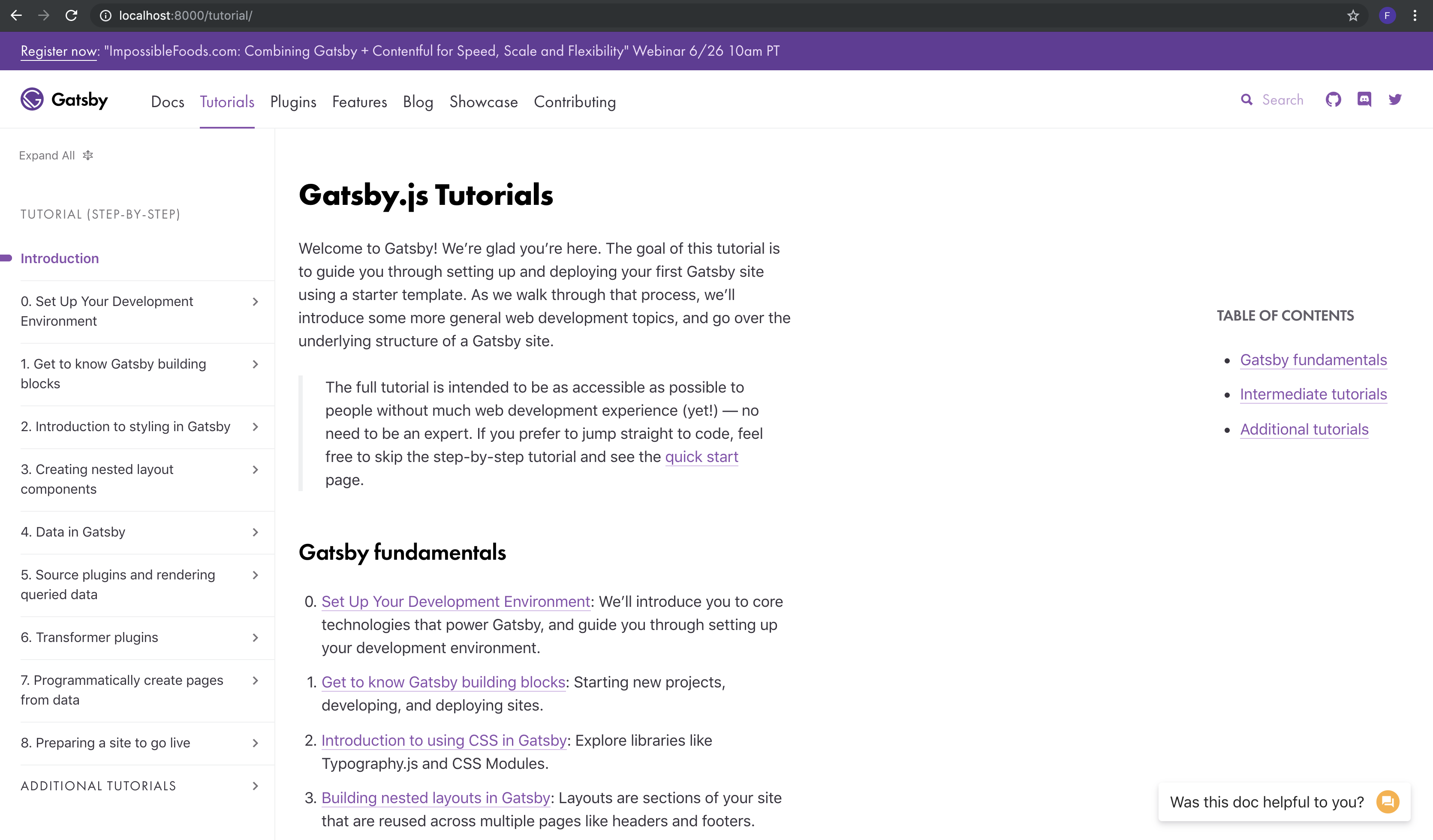
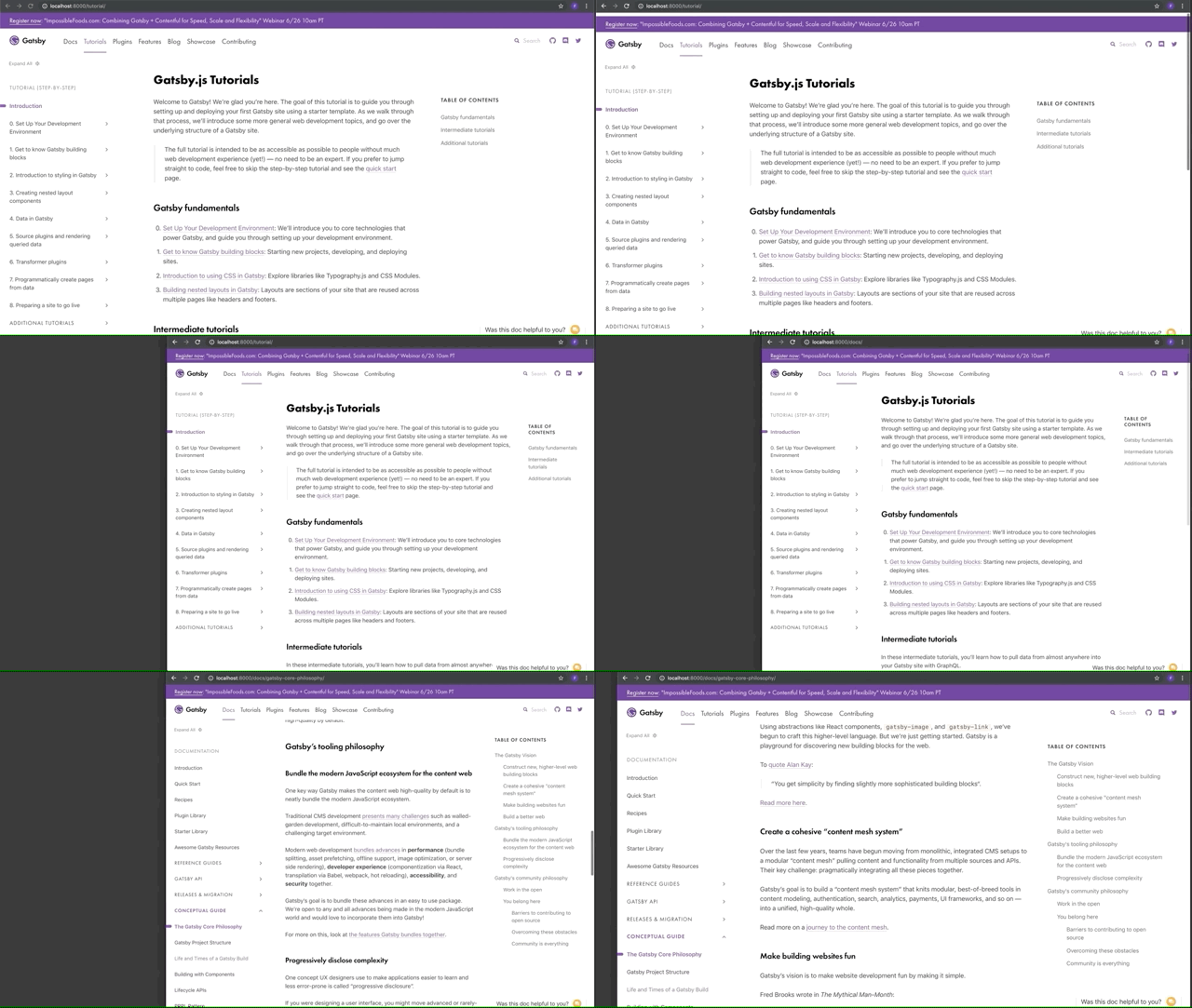
Here's a few screenshots of the current state:
On large screens, there now will be a floating component on the right that displays the Table of Contents. This uses
position: stickyso it will stick to the viewport as the page is scrolled down.On mobile and small screens, it will be in the flow of the regular document:
Related Issues
Fixes #6896