Skip to content
New issue

Have a question about this project? Sign up for a free GitHub account to open an issue and contact its maintainers and the community.

By clicking “Sign up for GitHub”, you agree to our terms of service and privacy statement. We’ll occasionally send you account related emails.

Already on GitHub? Sign in to your account

Update DevTools to Material 3 #5429

Merged
merged 22 commits into from
Mar 17, 2023
Merged

Conversation

kenzieschmoll
Copy link
Member

@kenzieschmoll kenzieschmoll commented Mar 16, 2023

Fixes #4601

There is still some polish to land as a follow up and some TODOs I will address, but this is the bulk of the migration.

RELEASE_NOTE_EXCEPTION=[release notes are modified - there is a bug in the check]

@bkonyi
Copy link
Contributor

bkonyi commented Mar 16, 2023

Some places that need UI polish:

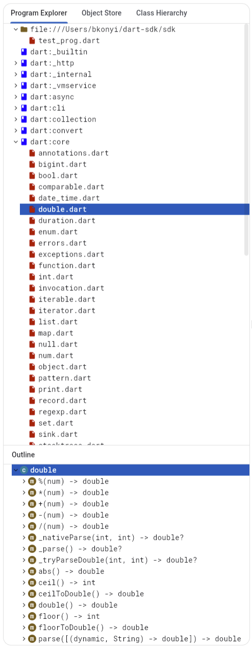
There's some places where the border outline is cut off at the corners (debugger call stack, file explorer, network requests table, logging, etc):

image

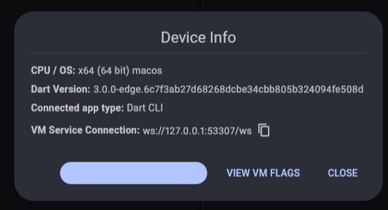
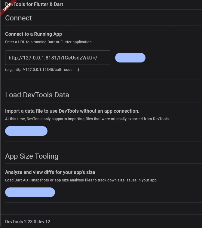
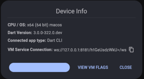
and some buttons with colored backgrounds have invisible text (connection screen, device info dialog):

image

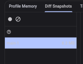
Text is unreadable in the heap snapshot tab:

image

We need some padding between the "Clear" and "(?)" buttons under the trace instances tab:

image

The "File Explorer" button on the debugger page should be a toggle button:

image

@bkonyi
Copy link
Contributor

bkonyi commented Mar 16, 2023

Light theme review:

Selected text contrast is low for table rows with light theme enabled (also there's no alternating colors between rows):

image

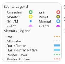
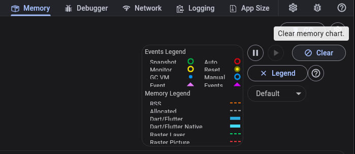
Not sure if this is due to this migration, but the memory chart legend is clipping text:
image

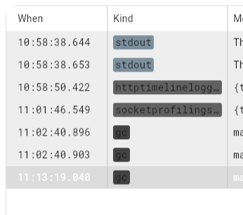
Logging screen labels have poor contrast:

image

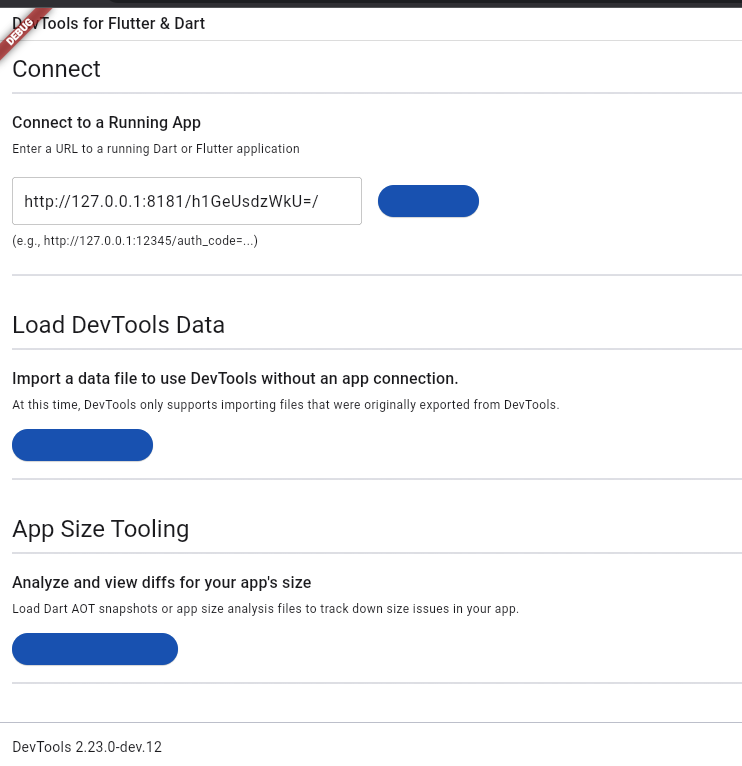
I think we should consider revisiting our color scheme for the light theme. There's very little color and the colors we do have feel rather harsh:

image

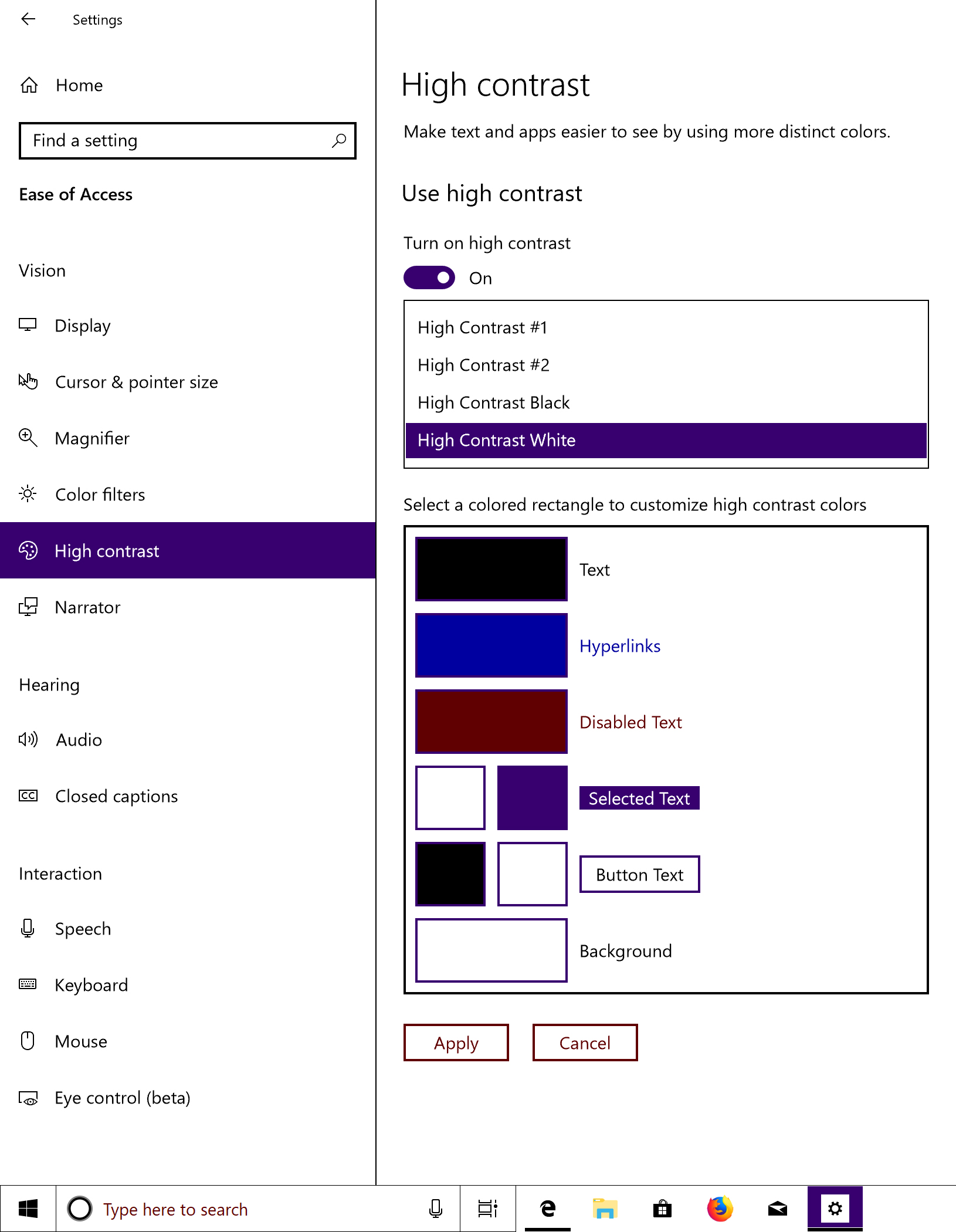
It feels like Windows high-contrast mode, which I'm not sure is the look we should go for:

image

@kenzieschmoll
Copy link
Member Author

@CoderDake
Copy link
Contributor

CoderDake commented Mar 17, 2023

Code looks good. I did some testing and found the following issues

  • Landing page buttons aren't readable

Screenshot 2023-03-17 at 9 52 30 AM
Screenshot 2023-03-17 at 9 52 15 AM

  • Cpu sample rate background is square, but button is round:
    Screenshot 2023-03-17 at 9 57 52 AM
  • Memory page line height seems to cut off the text
    Screenshot 2023-03-17 at 9 59 42 AM
  • Debugger button hover backgrounds are square
    Screenshot 2023-03-17 at 10 02 08 AM
  • Device info button not readable
    Screenshot 2023-03-17 at 10 06 58 AM
@CoderDake
Copy link
Contributor

@kenzieschmoll do you know if these material changes would fix this failure on master?
https://github.com/flutter/devtools/actions/runs/4445404285/jobs/7804598873

@kenzieschmoll
Copy link
Member Author

@kenzieschmoll do you know if these material changes would fix this failure on master? https://github.com/flutter/devtools/actions/runs/4445404285/jobs/7804598873

Those failures look unrelated. Those are for case study apps. Something probably is broken with those apps on the the latest version of the flutter candidate.

@CoderDake
Copy link
Contributor

For now kenzie is adding a release notes exception to the description to overcome a bug in the release notes workflow.
I've filed an issue for it here.
#5439

Essentially this PR has so many files, and the workflow doesn't support pagination when fetching the list of files modified :P :D

@kenzieschmoll
Copy link
Member Author

@kenzieschmoll do you know if these material changes would fix this failure on master? https://github.com/flutter/devtools/actions/runs/4445404285/jobs/7804598873

Those failures look unrelated. Those are for case study apps. Something probably is broken with those apps on the the latest version of the flutter candidate.

I added fixes for this to this PR. Just changed a couple min sdk constraints on the test fixture and case study apps

@kenzieschmoll kenzieschmoll merged commit 682ec58 into flutter:master Mar 17, 2023
@kenzieschmoll kenzieschmoll deleted the material3 branch March 17, 2023 19:52
@DanTup
Copy link
Contributor

DanTup commented Mar 22, 2023

@kenzieschmoll I tried this out in VS Code embedded view. Noticed a few minor issues (not sure if they're all related to this change though, or if any are dupes). If you'd rather another issue(s) for these, let me know.

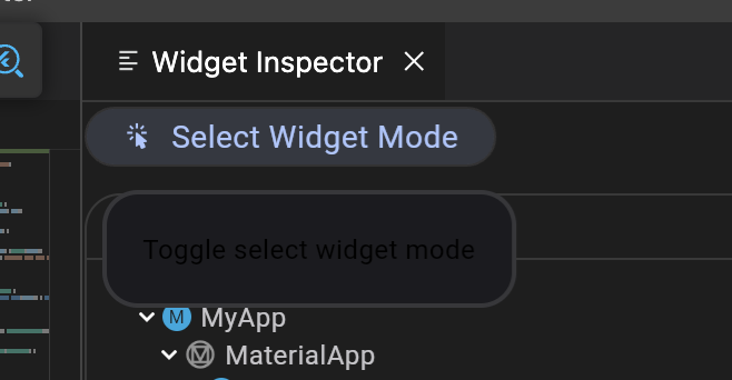
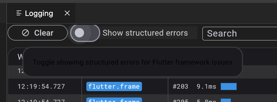
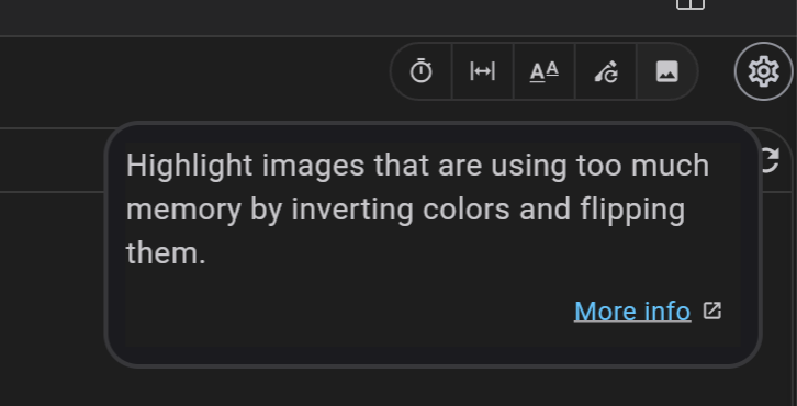
  1. Some tooltips are dark text on dark bg (Select Widget Mode, Show Structured Errors)
    Screenshot 2023-03-22 at 12 15 58
    Screenshot 2023-03-22 at 12 21 28
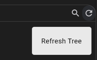
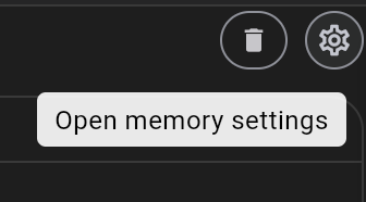
  2. Might be intended, but tooltip on Refresh Tree (and others, like Report Feedback, ) are opposite colour (dark vs light). Some also have a lot of padding compared to others:
    Screenshot 2023-03-22 at 12 17 15
    Screenshot 2023-03-22 at 12 17 19
    Screenshot 2023-03-22 at 12 22 26
  3. Alignment of hyperlinks in About dialog is off
    Screenshot 2023-03-22 at 12 18 39
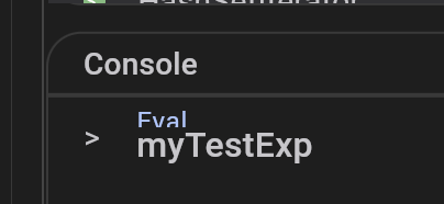
  4. "Eval" text is truncated when typing an expression in the Memory view:
    Screenshot 2023-03-22 at 12 23 19
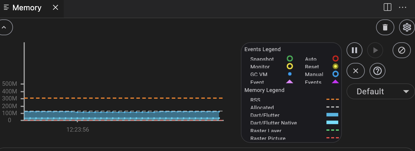
  5. Similarly, text in the Legend is truncated the same:
    Screenshot 2023-03-22 at 12 24 02
Sign up for free to join this conversation on GitHub. Already have an account? Sign in to comment
Labels
None yet
5 participants