

There's a growing sentiment around the web that when it comes to Android, stock is best. Many people prefer the clean look of Google's vision for Android, but manufacturers like LG will add features and themes on top of this base to differentiate themselves from the pack. But these OEM skins, as they're called, aren't always as overbearing as you might think.
The skin used by LG devices is known as LG UX, and it made its debut all the way back on the LG G4. Before that, it was known as Optimus UI, so it's had plenty of time to grow — now it's actually a pretty polished interface overall.
We're going to take you on a visual tour of LG UX and compare it to the "stock Android" UI from the Google Pixel. While it is by no means stock Android, it isn't as far as people would have you believe, and the changes aren't all terrible. The screenshots are from the new LG G7 ThinQ, which ships with LG UX 6.0, the latest version of LG's skin which is based on Android 8.0 Oreo.
Lock Screen
Let's start with the menu that greets you every time you wake your phone. With LG UX 6.0, LG made the background of notifications semi-transparent on the lock screen. You can still see the white background, but the lock screen wallpaper is also visible. Stock Android uses a solid white background that isn't transparent at all.

LG also changed the left quick launch app. While the bottom-right corner still brings up the camera, the left is changed from Google Assistant to LG's phone app.
Home Screen
The default home screen for the LG G7 ThinQ has a number of noticeable changes from stock Android. First, LG decided not to adopt the Pixel Launcher's new expanded dock which adds the Google search widget below the rows of apps. Instead, the search widget is separate from the dock, placed right above the row of apps.
LG doesn't include stock Android's "At a Glance" feature which shows the current date, along with other relevant information such as upcoming calendar events, flight information and traffic information. Instead, LG opted for a weather widget from a weather app they developed.
The default home screen doesn't have an app drawer. Instead, LG Home launcher places all apps on the rightmost page. Any new app will also add to the home screen like it would on iOS. This change is a far cry from stock Android which stores all apps in an app drawer that you can access using a swipe up gesture.


On the leftmost home page is AppFlash, a Google Now-inspired app which displays a list of articles you may be interested in and a row of frequently used apps. Stock Android has the Google Now page, which not only has a list of articles, but multiple tabs containing other information. For example, the Upcoming tab displays personal information such as reminders, flight Information, and commute information. You can also hide articles in your feed, unlike LG's AppFlash.


If you wish, you can swap AppFlash out for a feature called Smart Bulletin. Smart Bulletin is a series of widgets that provide access to LG-developed apps such as LG Health, Calendar, and Music.


As for each launcher's settings menu, LG's home screen has many more customization options, including the ability to apply themes and change the grid size. You can also adjust the animation when swiping between home pages.
The Pixel Launcher from Google's version of stock Android only has a few customization controls. You're limited to choosing whether to show Notification Dots, what information is displayed in the At A Glance widget, whether to show the Google Now page, whether to allow the launcher to rotate to landscape, and whether to enable app suggestions on the top of the app drawer.
For those of us who prefer to have an app drawer, LG has two additional launchers installed. "Home with separate app list" brings back the app drawer and includes the option to keep the app drawer button from the previous version of Android, or for a more stock look, replace it with a swipe up gesture. There is also EasyHome that enlarges text and icons, adds widgets which can be customized to call your favorite contact, and adds the app drawer button to the dock.


App Drawer
If you enable it, the app drawer in LG UX is still different than stock. First, its apps are organized horizontally, requiring a swipe to the left to see additional pages. Stock Android uses a vertical arrangement, requiring a swipe up to reveal other apps.
The background on LG UX is much more transparent than stock ,showing all of the home screen wallpaper. Stock Android uses either a white or black background, depending on the wallpaper (black wallpaper changes the background to black).


Additionally, LG allows you to hide apps, arrange apps individually, and sort apps by download date. Stock Android is confined to an alphabetical arrangement.
Notifications
Notifications are handled the same on both stock Android and LG UX — no changes to report here.

Quick Settings
LG arranges the Quick Settings (QS) tiles in four columns versus stock's three. Like the app drawer, stock's Quick Settings background adjusts based on the wallpaper of the home screen. The background is also semi-transparent (the same as the app drawer). LG uses a solid white background that is entirely opaque.
The brightness slider is also different. For LG UX, the slider is only available on the first swipe of QS (when only the top six tiles are shown), while stock reveals the slider after the second swipe. Additionally, the slider is blue on stock Android while LG uses a turquoise color.


The tiles are a light shade of gray on LG UX, and they change to turquoise when activated. Stock's tiles become black with a white background when activated (or white with a black one if a dark wallpaper is selected).
The gear icon on LG's Quick Settings (which launches Settings) is located in the upper-right corner instead of the bottom-right. Additionally, the pencil icon found in stock (which allows you edit the arrangement of tiles) is replaced by an "EDIT" button found in the bottom-right corner on LG UX.

Multitasking UI & Split Screen
Unlike stock Android, LG included three ways to initiate split-screen mode. The first method is long pressing the recent apps button. The second to long press the app in the multitasking view and drag it to the designated area to begin the process. However, the third way (which stock Android doesn't have) is by pressing the icon to the left of the "X" while on the recent apps screen. Selecting this button moves the corresponding app to one side of the screen and lets you pick the second app from the other apps in the multitasking view.

Share Menu
With LG G7 ThinQ's skin, you'll find four changes to the share menu. The first is the background is now gray compared to stock Android's white background. Second, the icons are rounded squares compared to stock's circles. Third, the share menu itself is rounded at the corners, while stock uses sharp edges. Finally, the direct share targets at the top of the menu aren't separated into their own section — they're simply additional options among your regular share targets.

Settings
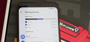
Settings is another area where LG made a lot of changes. Notably, LG UX uses colors for the icons while stock uses gray for all icons. Additionally, the text also shares this same gray color, while LG decided to use a black.
LG changed the name of options such as "Security & location" to "Lock screen & security." The order of arrangement is also different. For example, "Sound" is the sixth option on stock while LG made it third.


The arrangement is also different in each submenu, with Network & Internet making "Wi-Fi" the second option while stock has it first.


You will also find new options in both the primary Settings menu and in submenus. For the G7 ThinQ, there is a new option called "Extensions," which manages many of LG's new features such as Floating Bar (a small row of apps which you can access from any screen) and KnockON (double tap to wake or sleep).


LG also pulled out the System Updates feature from "System" (where it is located in stock Android) to the main Settings menu for easier access.


Finally, using the three vertical dots in the upper-right corner of Settings will allow you to switch to Tab View. Tab View is an alternative arrangement of Settings where options are organized in tabs. With this layout, LG reduces the number of submenus, allowing you to find what you need at first glance.


System Animations
The only noticeable difference between system animations is the animation for closing an app. Closing an app on LG UX 6.0 zooms into the middle, compared to stock's slide-down animation.

Phone App
LG's Phone app uses a green and black color scheme along with a white background. Like the stock Google Dialer, the app is divided using tabs with the dialer as the first tab. LG includes the addition of a fourth tab, Groups. Stock Android's Phone app uses a blue and white color scheme. The default tab is your favorite and frequently called contacts.


Messaging App
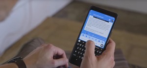
LG also replaced Android Messages with their own messaging app. The most significant visual difference is the color scheme on the main menu, with Android Messages opting for blue and white while LG opted for orange and white. While you're in a message thread, Android Messages will change colors to match that contact's picture.


What do you think of LG UX 6.0? Is it close enough to stock Android for you, or is it too far off? Let us know in the comments below, and tell us what skins you want us to compare next.
Hot Deal: Set up a secure second phone number and keep your real contact details hidden with a yearly subscription to Hushed Private Phone Line for Android/iOS, 83%–91% off. It's a perfect second-line solution for making calls and sending texts related to work, dating, Craigslist sales, and other scenarios where you wouldn't want to give out your primary phone number.


Be the First to Comment
Share Your Thoughts